Works
These are some of my best pieces of graphic design and art, either from work, school projects, or independent pieces.
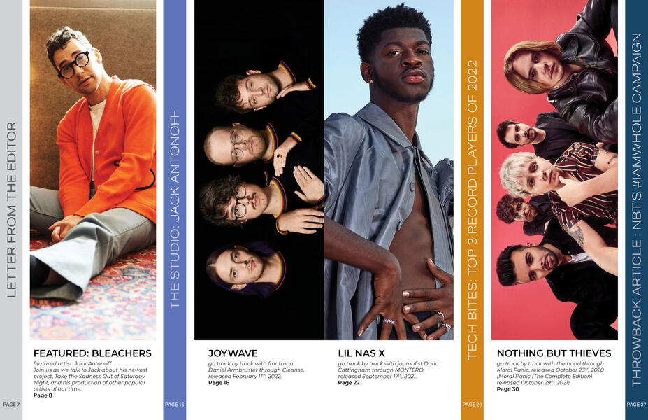
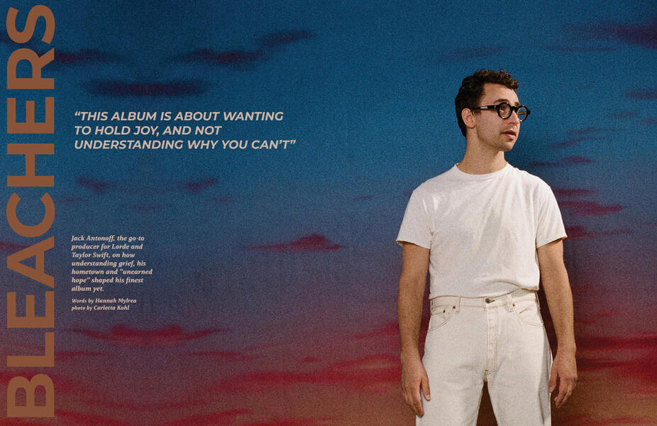
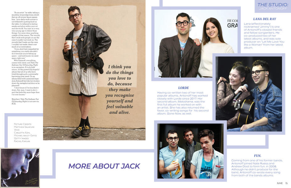
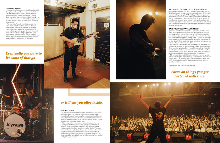
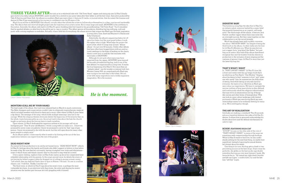
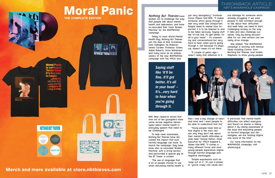
Magazine Design
Below are spreads from my publication design class at Washtenaw Community College. The goal was to design a decently sized magazine with tons of content, completely from scratch. I started by looking at other music based magazines, taking in how they handled department pages and ads, then got to work. This was a very fun project to work on, and to see it come together at the end was very rewarding. Click to view the spreads at full view!
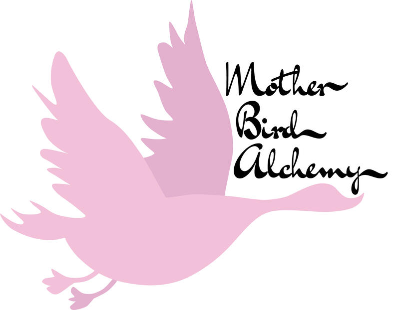
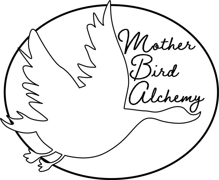
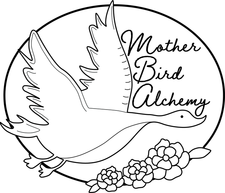
Mother Bird Alchemy Logo Design
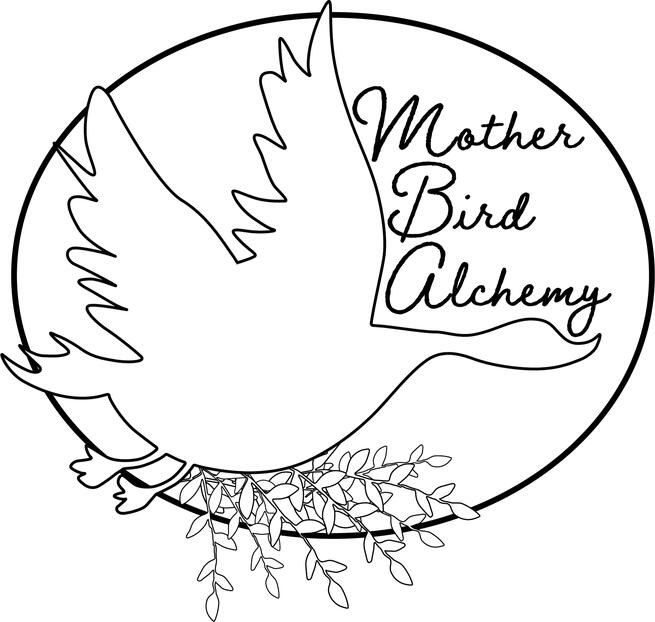
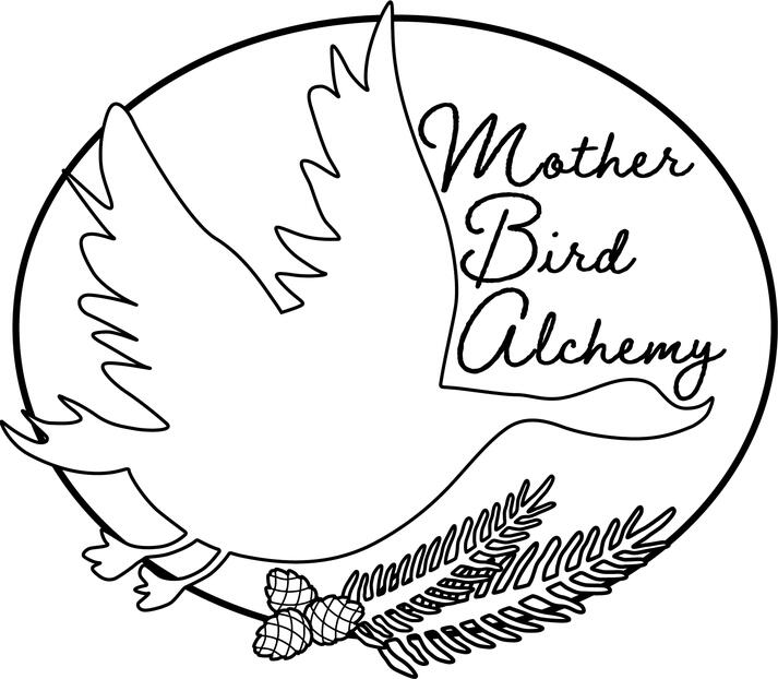
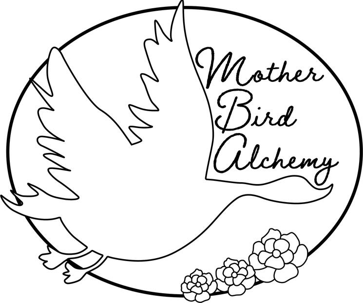
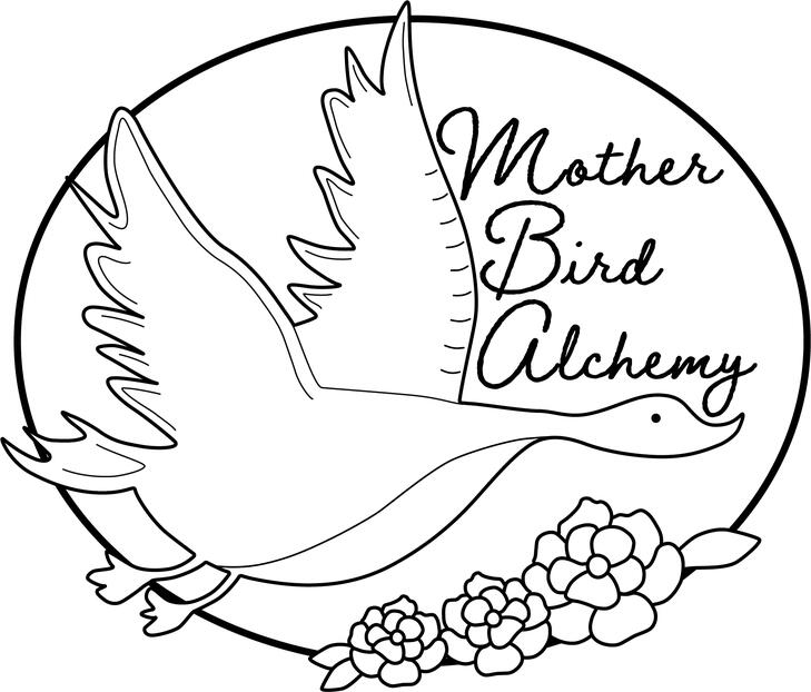
Below is a logo I created for Mother Bird Alchemy, a local soap maker. This was my first real experience building a logo from scratch and working with a client. I first looked around at other local artists logos to see what the vibe was, then started sketching. From there I sent version after version to the client, making sure it was exactly what they wanted. Overall the experience was very rewarding and I learned a lot during the process!
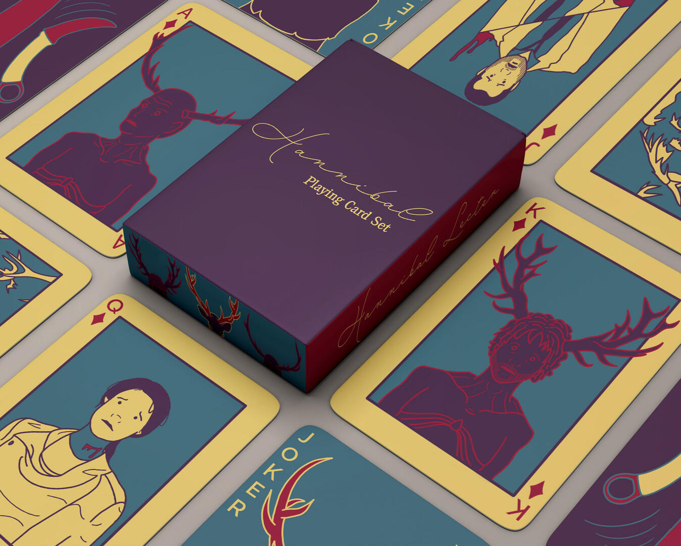
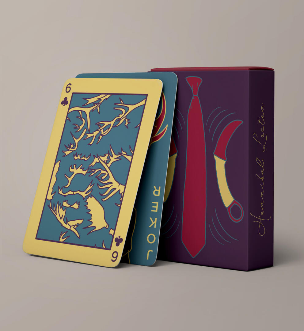
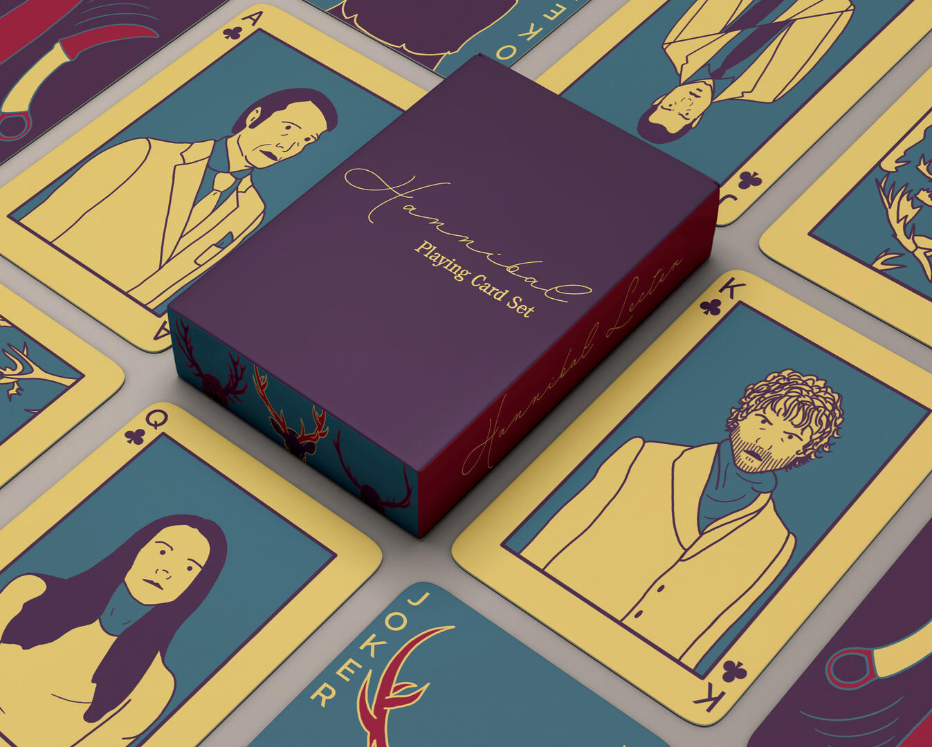
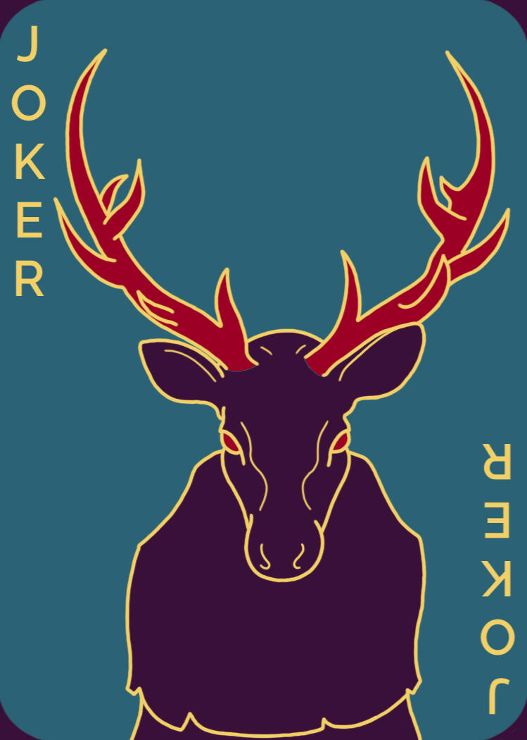
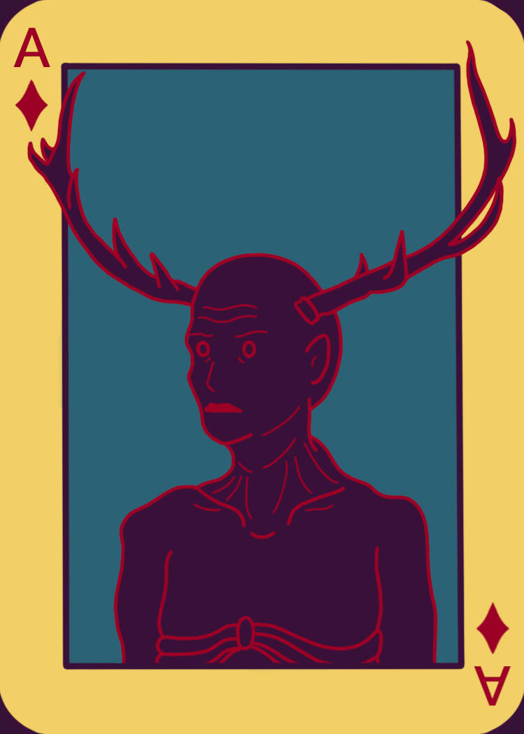
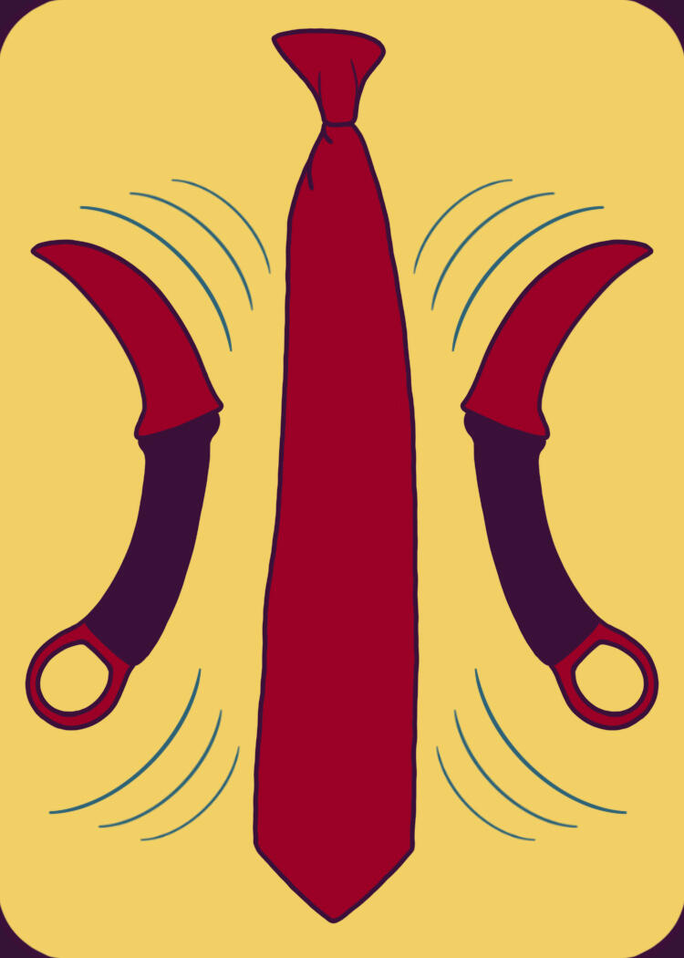
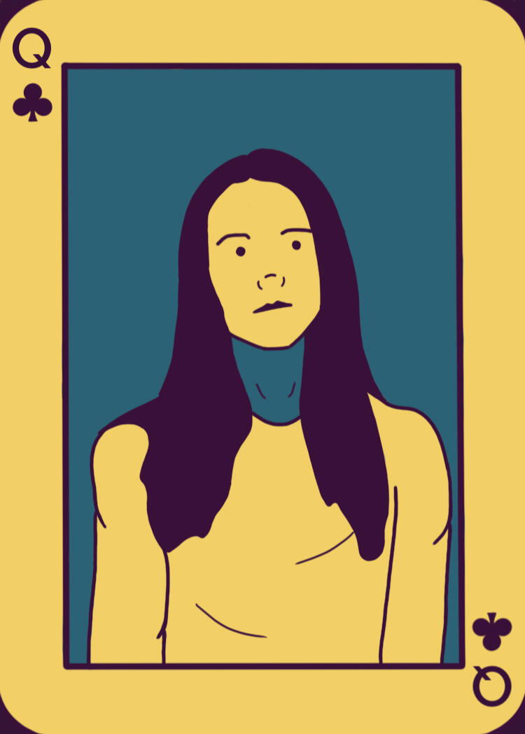
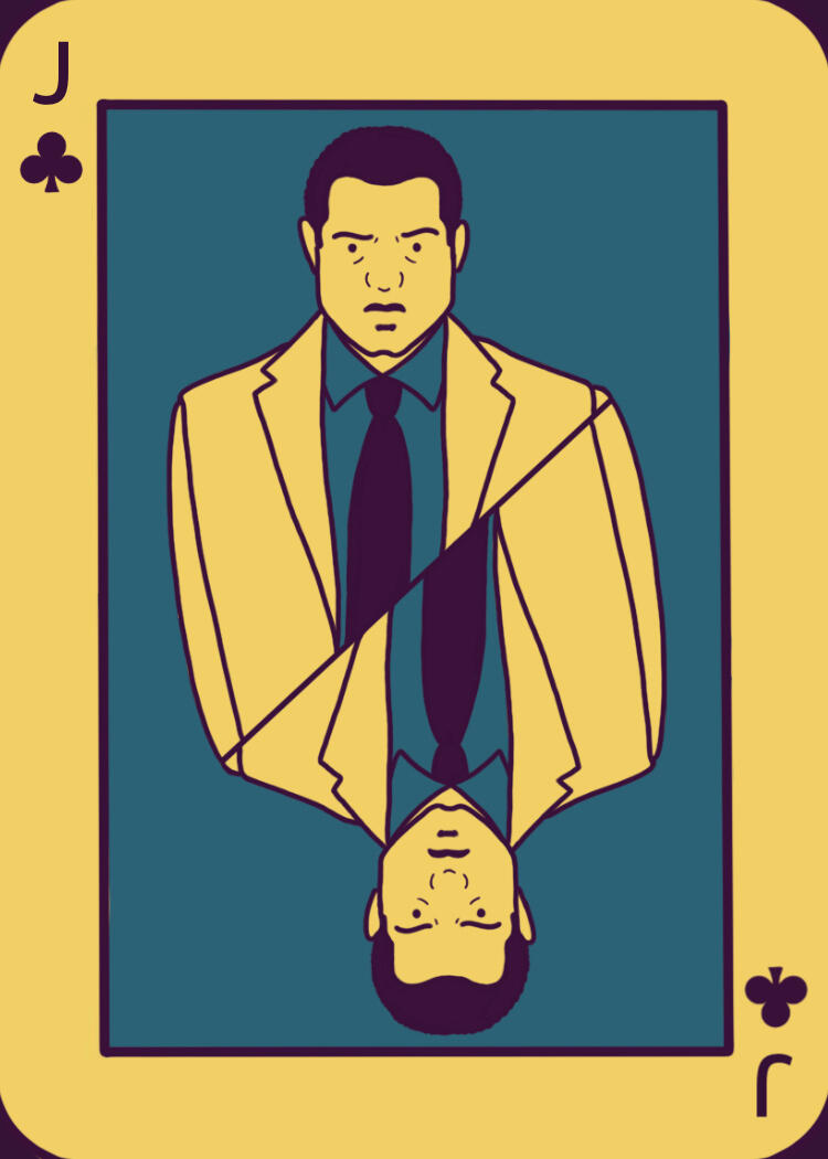
Hannibal Playing Cards
Below are my Hannibal playing cards from the imaging and illustration class, also from WCC. This project was super fun and I was able to demonstrate my illustration skills while still sticking to the project guidelines. After finishing the images, I was able to create the mockups shown below. My favorite part is the sides of the boxes with the extra ilustrations, especially the antlered heads.
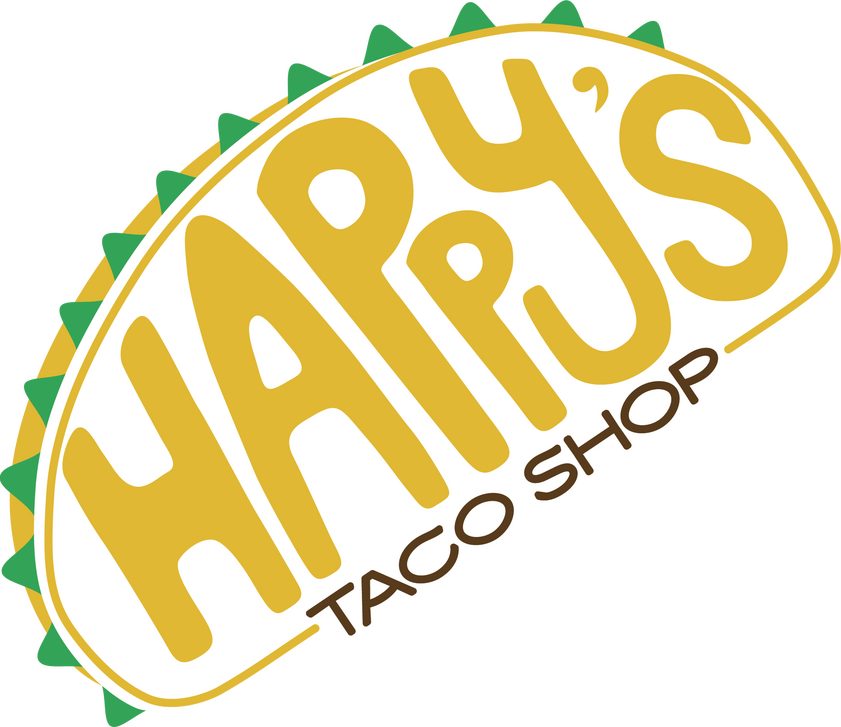
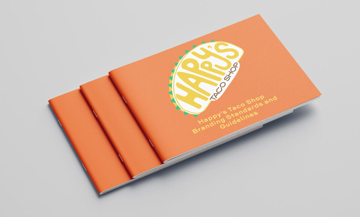
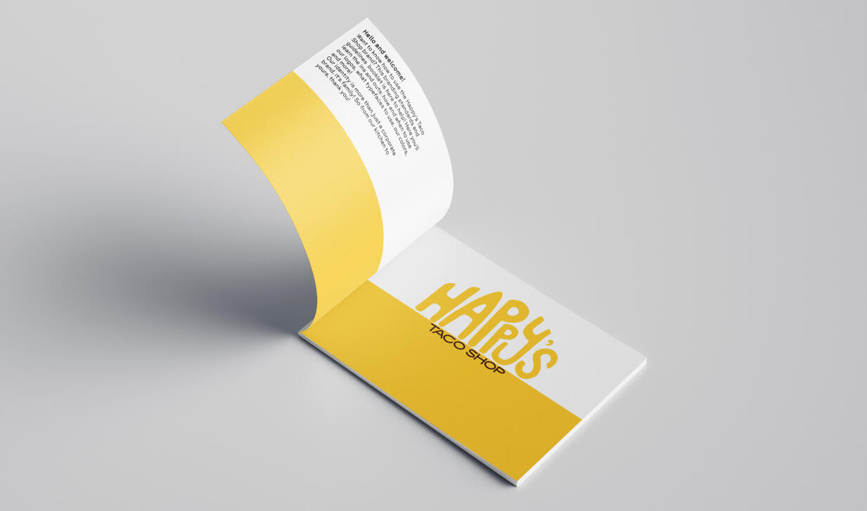
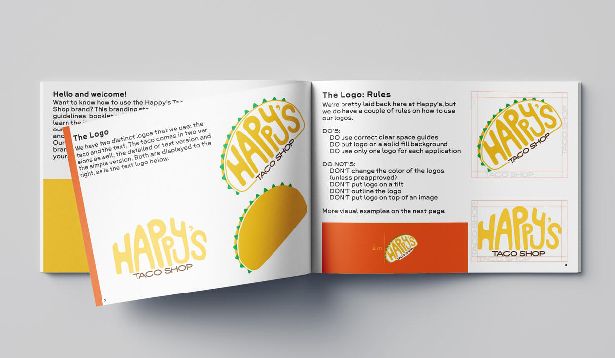
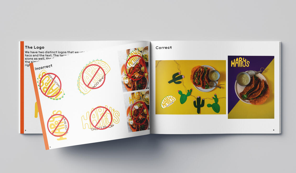
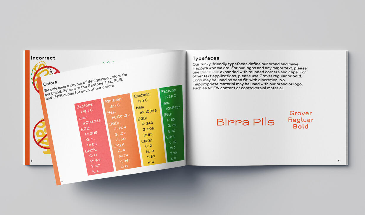
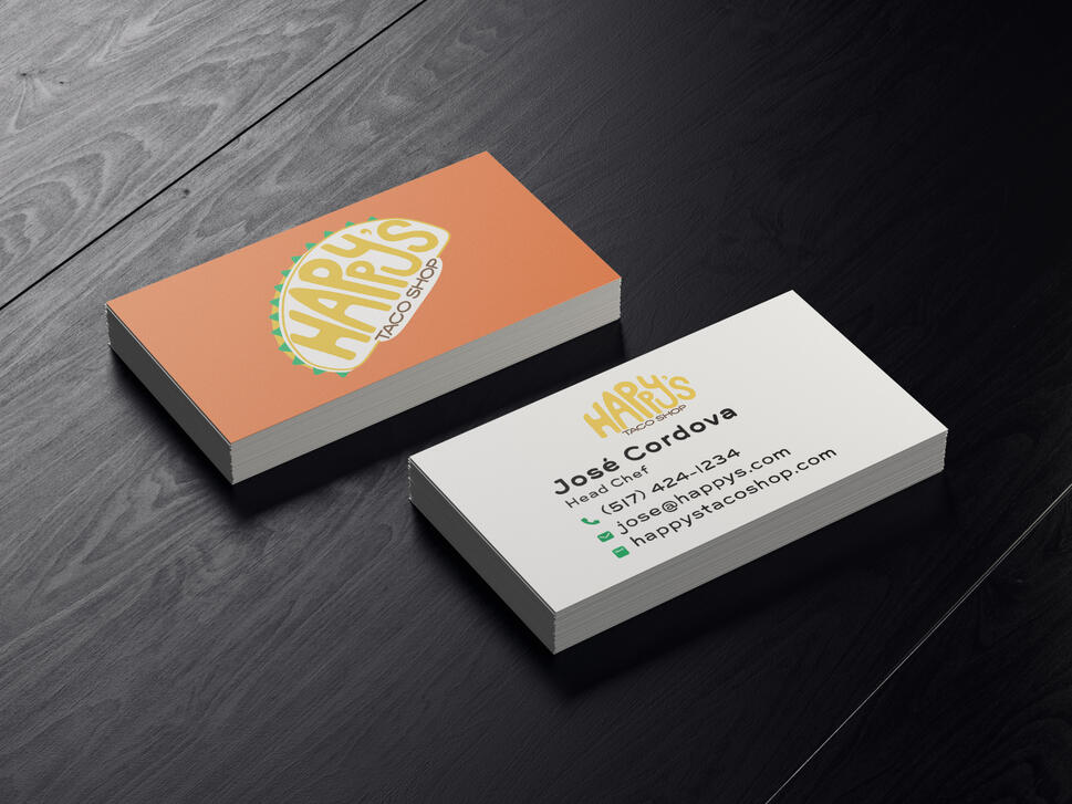
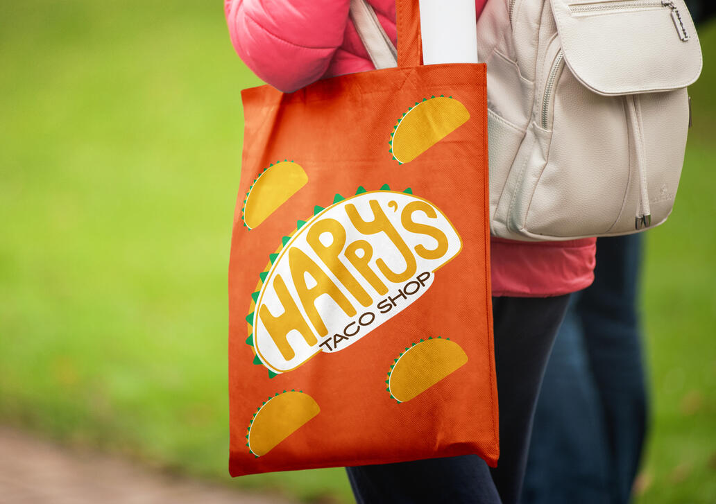
These are pieces from my advanced digital studios class. This projects goal was to create a brand identity for a food truck from a given list of names. I chose Happy's Taco Truck because there is a taco food truck in town that I've become close to, so this project felt a little more personal. This was a big project, including lots of different details such as business card design, food packaging mockups, website design, and more. It was also a fun and fulfilling project, to see something come to life will always wow me.
HRWC Annual Report
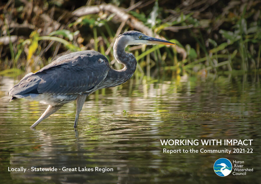
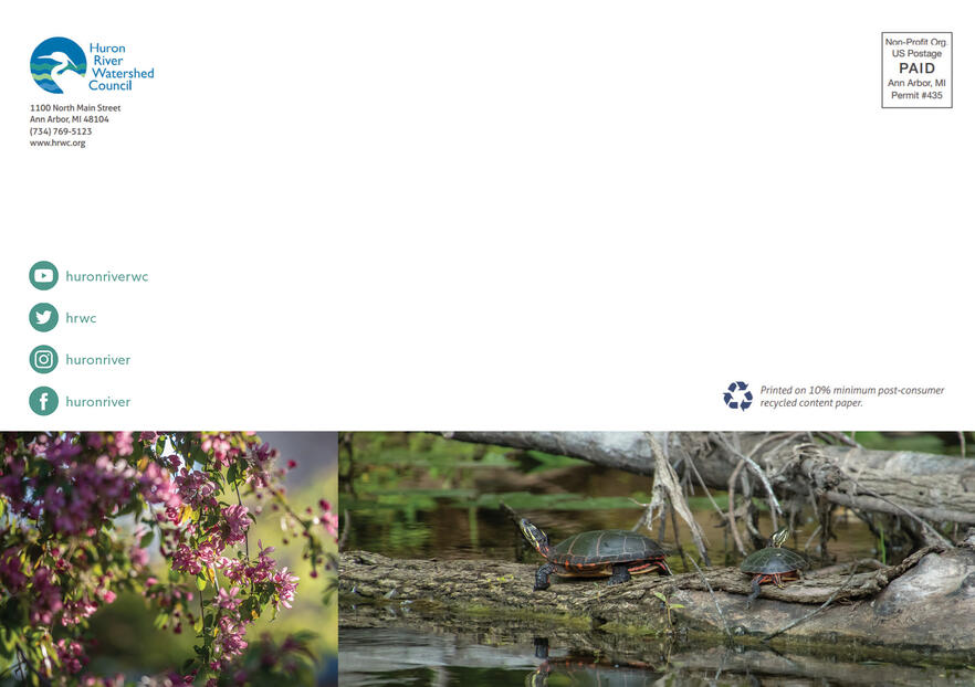
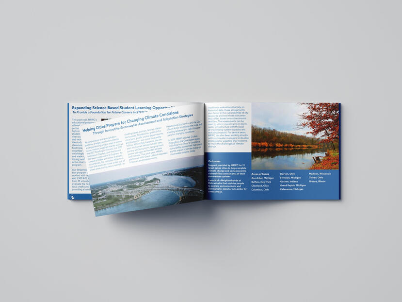
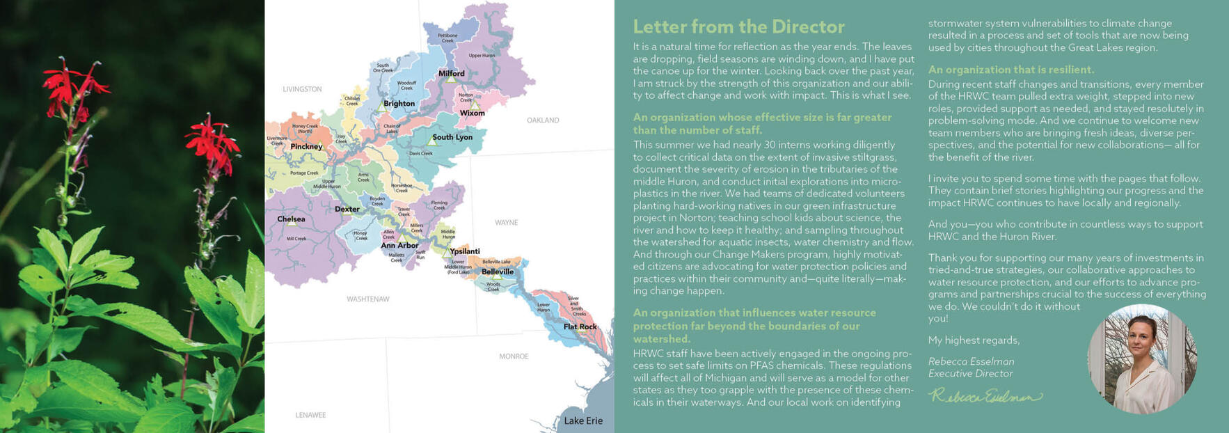
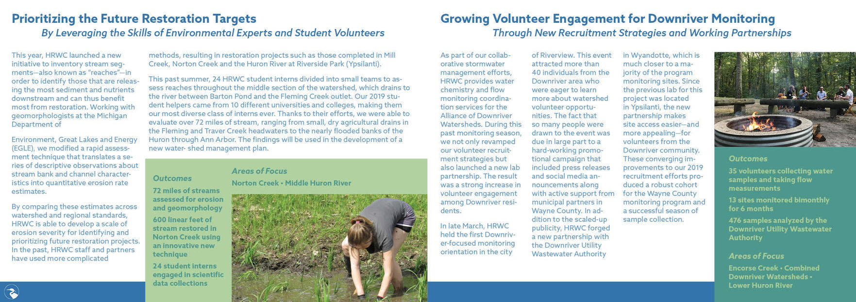
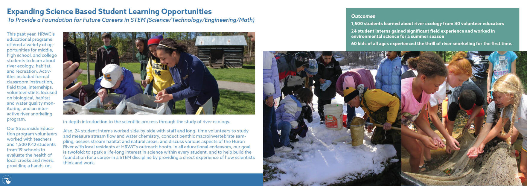
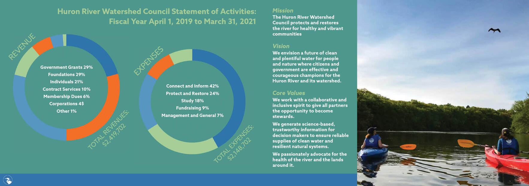
Below is my annual report for the Huron River Watershed Council, also from my publication design class. This project was difficult as there was a lot of content to fit in a somewhat small booklet, however I was very happy my final version. I also chose a mildly difficult layout as well, further adding to challenge. Each page flows with matching colors to the brand, as well as sleek typefaces to make reading easier (as there's a lot of reading).
Personal Pieces
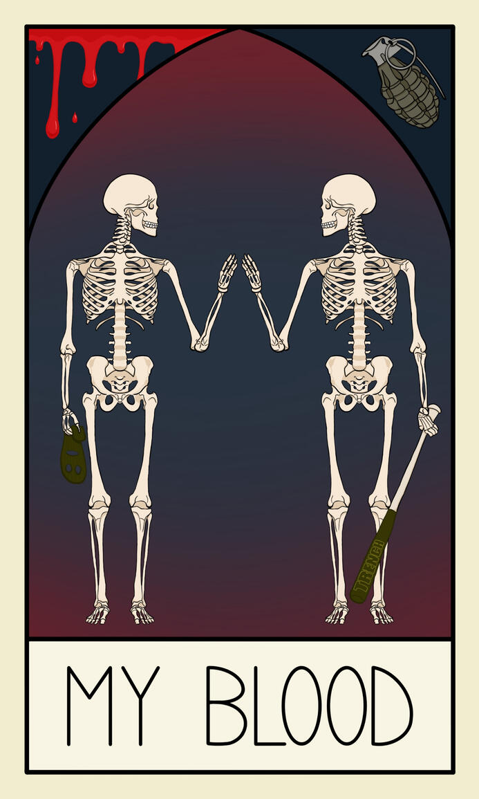
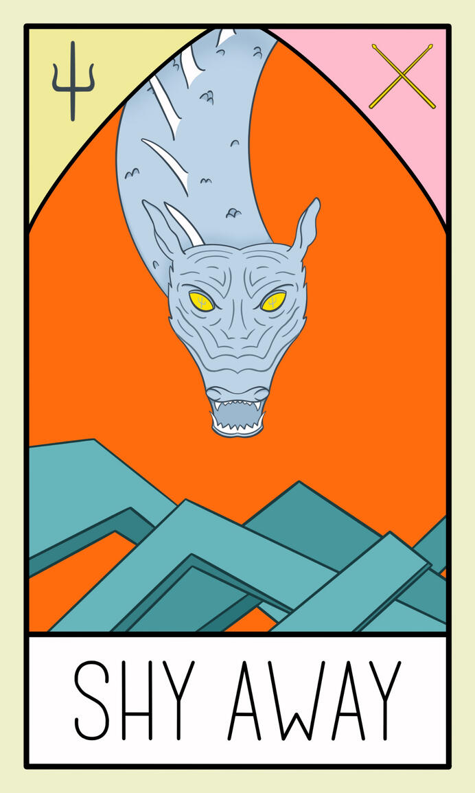
These are some examples of tarot cards based on songs I was making for a short time.
They are both Twenty One Pilots related, but I also made some My Chemical Romance based ones as well.
